
Brand guidelines
The Queen of Spades, drawn as a system.
The identity borrows its logic from the work: precise, constructed and calm. Nothing decorative that does not also carry meaning.
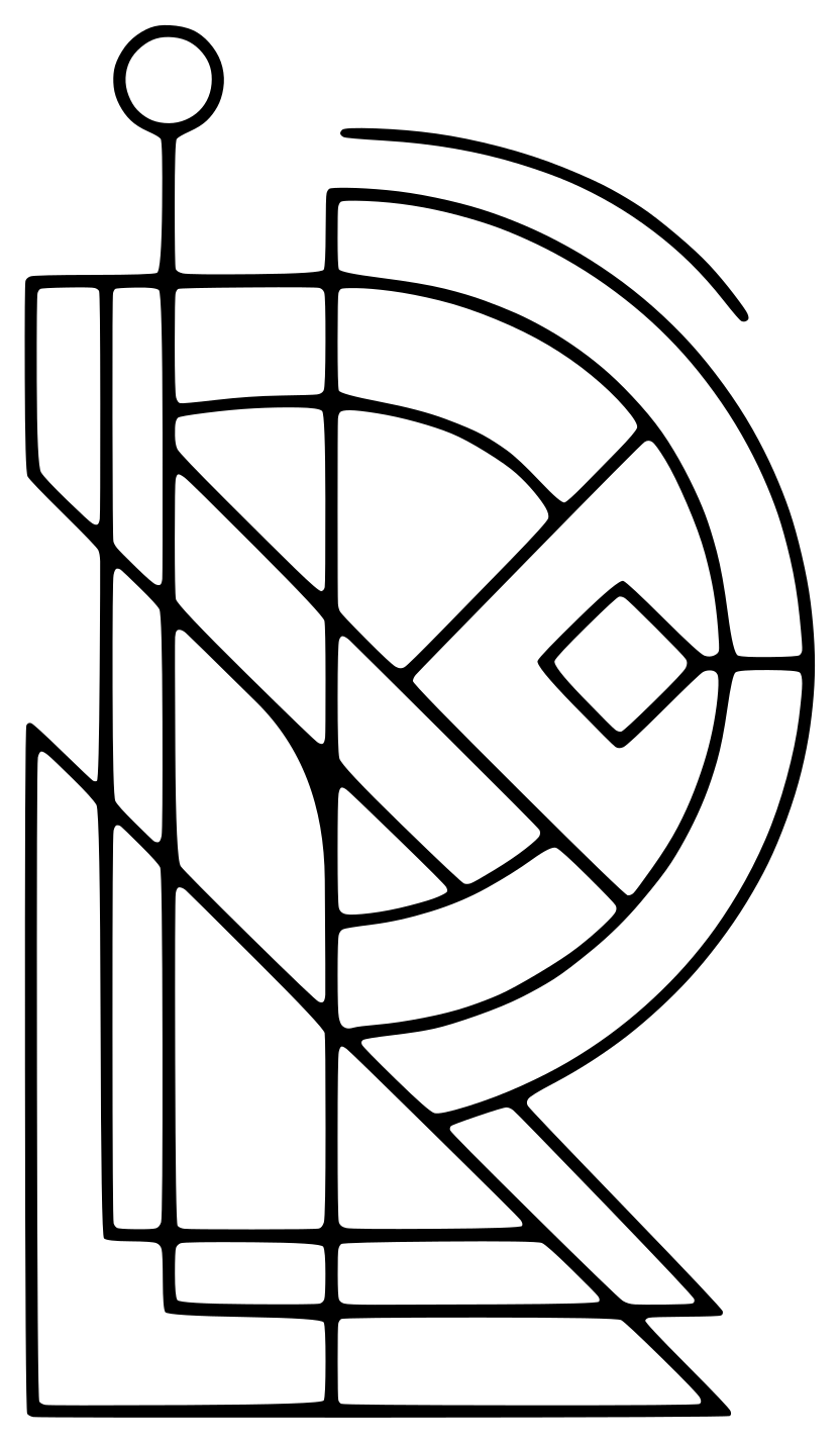
The card
The queen of spades holds authority without announcing it. It anchors the identity and appears as the corner index on cards and portraits.

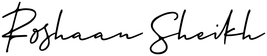
The signature
A human mark to balance the geometry. Used to sign off, never to decorate.

Colour
Ink and paper carry the page. Crimson is a highlight only: one per view, never for body text.
Click a swatch to copy its value.
Type
AaAaAa
Outfit Light for headlines and figures. Inter for reading, titles and interface. JetBrains Mono for data only: dates and codes. Instrument Serif Italic marks the one keyword in each headline and sets the Q♠ card index. The handwritten signature is used as artwork, never as a typeface.
Voice
- Clear over clever. Plain words for complex systems.
- Human over technical. Start from the person using it.
- Evidence over adjectives. Show the result, then the claim.