AI Driven Customer Experience Dashboard
Project Overview
This Product identifies subtle and valuable patterns in human interactions, which facilitates better pairings between a customer and the optimal agent to drive better outcomes from resulting conversations. The product represents a significant step-change in the availability of AI-driven behavioral pairing technology for organizations of any size, rather than solely large enterprises, expanding the total addressable market by millions of agents. The product is an intuitive self-service product that enables organizations to add their own data sources, select the key metrics to optimize for, and view the AI model performance using a detailed portal. Customers are able to track the real-time incremental value delivered to their businesses, allowing them to rapidly adapt to changes in market, industry, environmental, and consumer demands.
Platform
- Desktop
- Tablet
Challenge
The biggest challenge was to understand and also build the AI requirements for the platform. As the product is for Telcos and will be used by call centers, it had to be a usable product with scalability in mind.Maximize efficacy of offer recommendations – maximize ROI, and improve agent engagement on calls. Align agent with business’s customer strategy.
Strategy & Approach
Combination of the technology (functional part) and modern design aspect.
My Contribution
For this project, I have worked on the entire product design from research to conception, visualization, and testing. The design is in line with Google’s Material Design guidelines. You can read about the process below.
Scope
Build a prototype that integrates a Chatbot with a live agent and uses a mock AI engine to pair the customer on chat with an agent to support them. The scope of this prototype will be limited to the web version.
Intuitively interact with and respond to a customer autonomously and Attempt to detect customer intent via conversation while answering knowledge-based questions. And extract information based on the channel of origin.
User Research/Journey
User Interviews
The advanced analytics team, customer service team, and model developers are internal users of the product. They are also the users of POC. User interviews have been conducted one-on-one or team by team to gather information about their needs, pain points, how they use the product, and how the product makes their life easier.
The product has different user roles based on the company personas.
User Personas
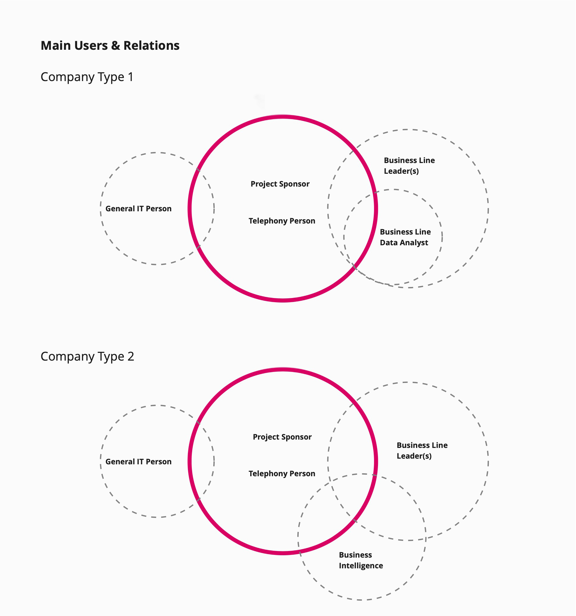
In terms of users, the company connects 2 types of audiences in our system, providing the technology for them to operate. We identified our relevant customers and prioritized their goals, needs, and motivations. This helped to shift perspective from a features-first to a users-first mindset. In our case our uses are companies.
Small/Medium/Large & BPO Companies
- Contact center managers.
- Business line managers (no business line manager if the contact center is only working as a customer care center).
- IT/Telephony person.
- Data person.
- C-level follows contact center actions closely.
Research Workflow
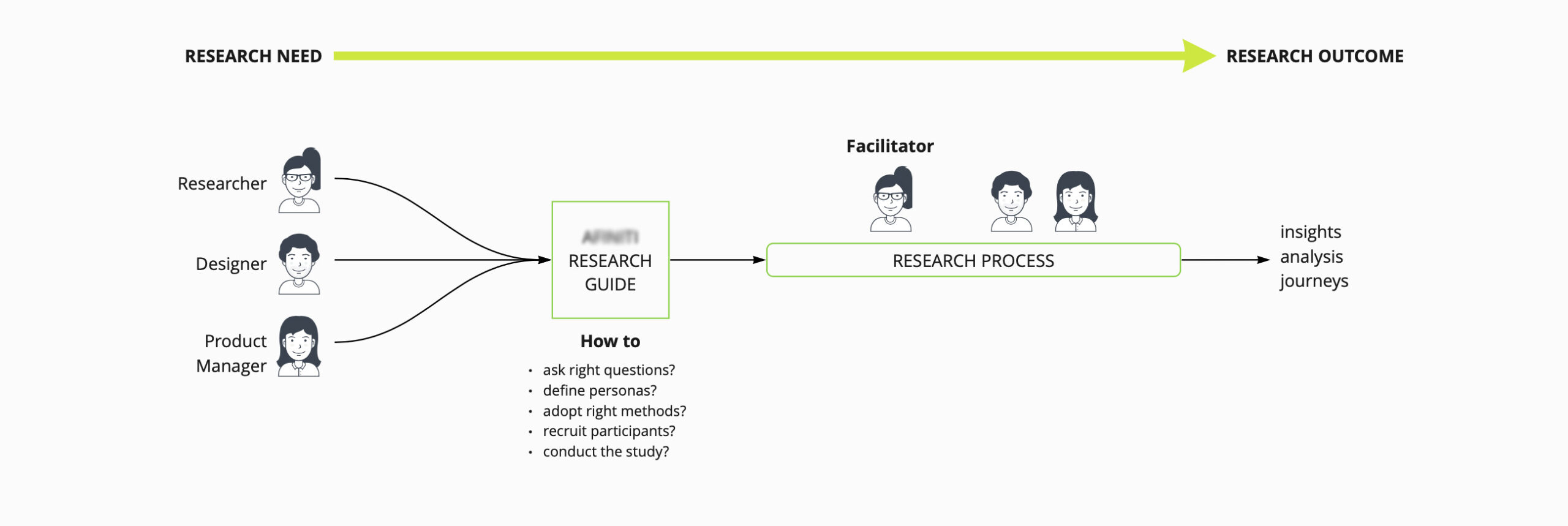
User Roles & Priorities

Client Segmentation

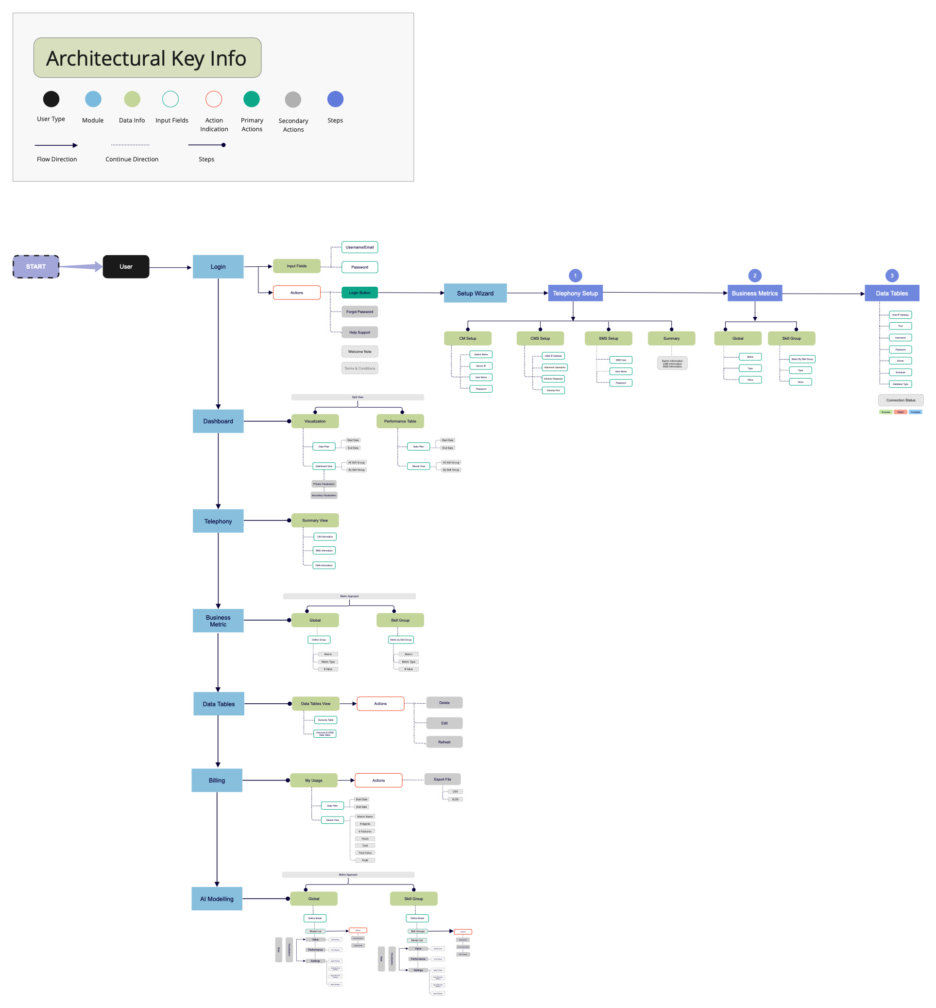
Defining The Architecture
After that, I proceeded with creating a flowchart and system architecture diagram to show how the platform would be organized. Our design team had a thorough discussion about client needs and what are their demands. We also had discussions with cross-functional teams in daily scrum and sprint planning. Designing for a data-heavy platform resembles the work of a sculptor – you start with a massive block and then slice it away until you reach just the right thing. Data-driven applications are different in a way, that less data often means a less practical and useful solution. Keeping all the data you can, however, yields an unworkable app. It’s all about finding a balance, prioritizing, and organizing features according to the main use case.
Customer Journey Map
A product-based journey map helped to better understand the overall product as well as the user and their experience with them. Based on the insights gained from the initial content audits, competitor analyses, and Card Sorts with potential users, I defined the architecture diagram of this AI-driven product and then evaluated it via card sorting, five minutes of testing with potential stakeholders.
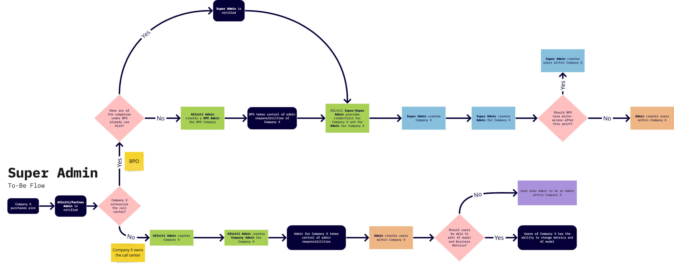
Taking the “Super Admin” as a detailed user flow structure
Wireframing, Prototyping & Usability-Testing
Based on the above problems identified, I worked towards addressing these pains by coming up with potential solutions:
- Reducing the number of steps to minimize time to completion
- Surfacing mandatory fields and enabling the Next button to show error validation
- Establishing a clearer visual form hierarchy by grouping related fields
- The lack of a formal wizard component also meant that I had to come up with a standardized styling and UI pattern for future wizards
Wireframes Based On User Personas
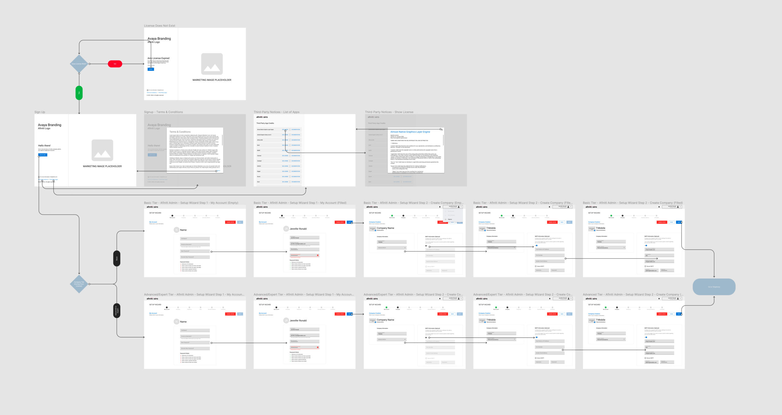
After we defined the flow and thus what screens we needed I proceeded with creating the wireframes to explore the experience in more detail on a screen-by-screen level. The main focus was to create a wireframe with not just a clickable prototype for demos but also a helpful guide for all the teams (backend developers, UI designers, Frontend developers, and Project Managers). So, we came up with the idea to add arrows based on user personas so anyone who is viewing the wireframes from any team can easily understand the flow screen by screen.
Wireframe of the one module “Super Admin”
Bug Fixing Via Flow Diagram & Time Management
We all make mistakes. So, UX design must deal with them! When digital products are made of processes and algorithms, their users have goals, desires, knowledge, skills, and especially contexts of use that are anything but binary! Adopting a user-oriented approach to re-think the error management of a digital product allows for overall UX improvement.
As a part of the highly qualified team, We started fixing bugs based on the feature requests. It helps us in defining new requirements based on the previous data. and also time management helped us in making our system more smooth and more user-friendly in terms of its speed.
New request backend data check flow diagram

Time Management Tracking Report

Usability Testing Based On Heuristic Evaluation
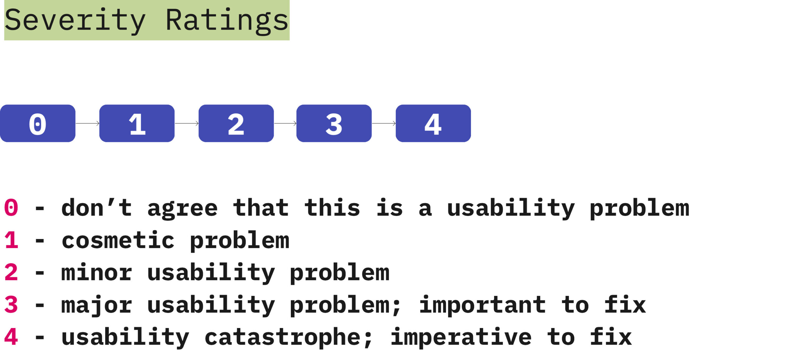
In this phase, we have followed the different techniques and Heuristics evaluation is one of them. Generally, we follow principles for user interface design that can be adopted as usability guidelines. Based on how well the identified system or Web site meets these guidelines, a rating is assigned. This rating is measured on a Likert scale of one (1) to five (5). Five (5) is the highest grade; meeting the standard and one (1) is the lowest grade; falling below the standard. We have used both spreadsheets and screenshots to measure the scale based on severity level. Our team feels strongly that these recommendations will enhance the user experience overall.
Understanding
- Consistency
- Use Familiar Metaphors & Language
- Clean & Functional Design
Action
- Freedom
- Flexibility
- Recognition Over Recall
Feedback
- Show Status
- Prevent Errors
- Support Error Recovery
- Provide Help

A/B Five Minute Testing
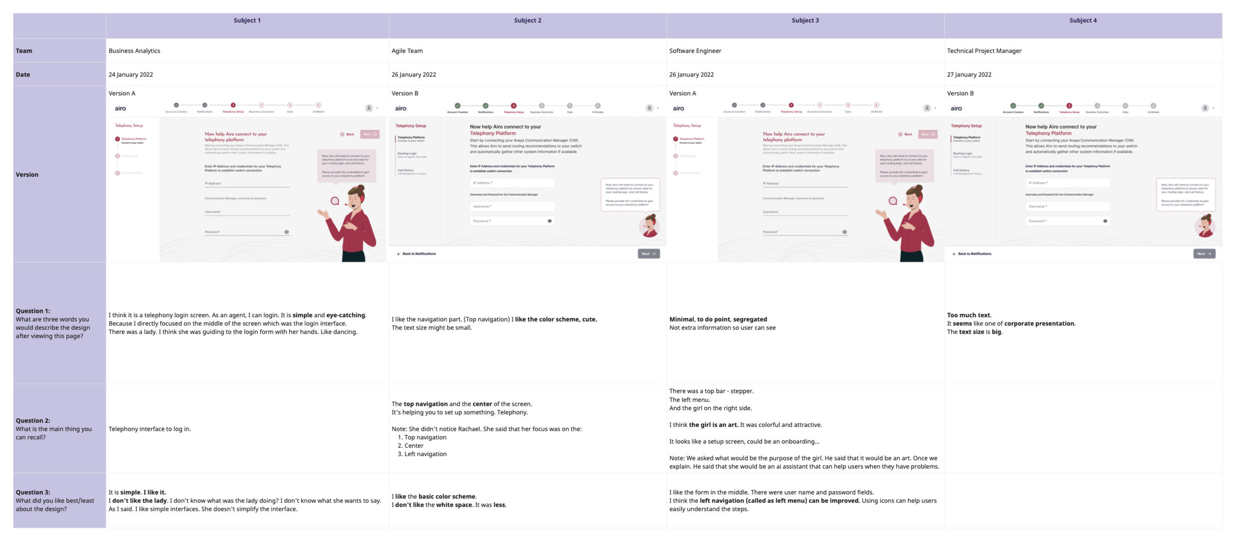
To quantitatively review the usability assumptions, I did A/B five-minute testing and click test along with my UX researchers with the cross functional team within the organization. , which confirmed my assumptions except for a few details. First and foremost, I tested the setup wizard screen with two possible UI variations, based on UI structure, content placing and chatbot placement and what message is displayed by the chatbot or is it easy to understand and as well as preferences regarding the visual design.
Conclusion & Learnings
Some key takeaways from this project are:
- Create a strategic plan to launch an MVP. This helps deal with out-of-scope requests that could potentially derail the project and help deliver a quality product in time.
- User testing doesn’t end after development. Design is a constant iteration of improving the experience for the end-user. Always find ways to collect and listen to your user’s feedback.
- Involve engineering upfront. This helps to reduce any rework later on as an understanding of the technical limitations upfront will help to inform your design strategy.
- Journey mapping is very helpful, on the one hand, to put a comprehensive process on paper and to uncover problematic and promising points, on the other hand, to provide a basis for good cooperation for all stakeholders.
- I would rebuild the interviews differently as I used too many questions where interviewees should imagine what the optimal solution might be.